The WordPress Page Builder Problem Nobody Wants to Admit
If you've shipped more than three WordPress sites, you already know the drill. You install Elementor or WPBakery, drag a few rows in, and within a week you're debugging why the DOM looks like a lasagna of div.elementor-widget-wrap wrappers. Core Web Vitals tank. Your client asks why the site feels slow on mobile.
Traditional builders solved accessibility, then quietly introduced a new set of problems: rigid row/column grids, plugin sprawl (ACF for dynamic content, a separate form plugin, a popup plugin, an animation plugin…), and code output that no senior developer would ever write by hand.
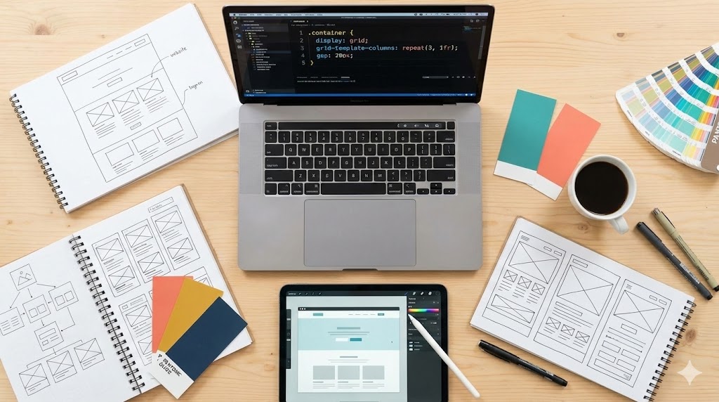
Kirki is an attempt to break that cycle. Instead of layering more abstractions on top of the classic builder model, it rebuilds the editing experience around a freeform infinite canvas — closer to Figma or Webflow than to Elementor.
This piece is a technical breakdown, not a sales pitch. We'll look at where Kirki genuinely differentiates, where it's still catching up, and whether the trade-offs make sense for your stack. For a broader look at how the WordPress ecosystem is shifting toward integrated, dependency-free tooling, see our analysis of the React Foundation's governance shift — the same "stop reinventing, start consolidating" pattern is playing out across the JS and CMS worlds.
Source basis: This review draws on the original hands-on write-up published by Smashing Magazine.
What Actually Makes Kirki Different
1. Infinite Canvas Instead of Rows and Columns
Most builders force you into a grid. Kirki lets you place elements anywhere on a pannable, zoomable canvas — overlap sections, layer backgrounds, and control each element's layout behavior per breakpoint.
If you've used Figma, the muscle memory transfers instantly. If you haven't, it's still the most natural mental model for design work.
2. Concurrent Responsive Editing
This is the feature that actually changes workflow. Desktop, tablet, landscape, and mobile views sit side by side on the same canvas. You edit them simultaneously, and changes cascade downward from larger breakpoints — so a desktop tweak automatically propagates to tablet and mobile unless you override it.
No more "switch to mobile view, fix, switch back, break desktop, repeat."
3. Native Dynamic Content (No ACF Required)
This is where Kirki diverges hardest from the WordPress norm. Dynamic content is built in:
- Custom post types and custom fields
- Reference and multi-reference relationships
- Visual template building
- Dynamic SEO on template pages
- Advanced filtering on Collection elements
No ACF. No CPT UI. No Metabox. That's three plugins removed from your functions.php dependency graph.
4. Class-Based Styling + CSS Variables
When you style an element, Kirki saves it as a reusable CSS class. You get:
- Global classes for buttons, cards, headings
- Subclasses for variations (e.g., secondary button inheriting from primary)
- Global design tokens (colors, fonts, spacing) as CSS variables
- Automatic light/dark theme switching via variable swaps
This is the correct architecture. It's what Tailwind and modern design systems have been preaching for years, finally showing up inside a visual builder.
5. Real Multi-User Co-Editing
Multiple team members on the same page, live cursors, color-coded edits, and canvas-pinned comments. This is the first real Google-Docs-style experience in WordPress. For agencies and freelance-client workflows, this alone can replace a lot of Slack back-and-forth.
6. Kirki Apps (Centralized Integrations)
Analytics, CRMs, email platforms, and support widgets are installed from within the editor. No leaving the workspace to hunt down a plugin, activate it, then configure it in a separate admin panel.

Performance and Pricing: Where Kirki Actually Wins
Lighthouse Comparison vs Elementor
Both builders were tested under identical conditions: clean WordPress install, Twenty Twenty-Five theme, same layout structure, same design elements, Lighthouse scoring.
| Metric | Kirki | Elementor |
|---|---|---|
| DOM depth | Shallow, minimal wrappers | Deeply nested elementor-* wrappers |
| Script payload | Lightweight, conditional | Heavier, loaded even on simple layouts |
| Core Web Vitals | Strong across the board | Noticeably degraded on mobile |
| Code cleanliness | Human-readable output | Machine-generated markup |
| Overall Lighthouse score | Higher | Lower |
The takeaway isn't "Kirki is faster by 3 points." It's that Kirki's output is the kind of code a senior dev would actually ship, while Elementor's is the kind you spend a weekend cleaning up.
Pricing Reality Check
| Plan | Kirki | Elementor Pro |
|---|---|---|
| Free tier | Genuinely feature-packed | Functional but gated |
| Entry paid | $59/yr (1 site, all features) | $60/yr (Essential, features still gated) |
| Lifetime | $499 one-time | Not offered |
| Upsells | None | Frequent (add-ons, widgets, kits) |
Kirki's pitch is "what you see is what you get." Dynamic content, popup builder, form builder, submission manager — all in every plan. That's a meaningful difference from the add-on economy most builders run on.
Honest Limitations
- Learning curve is real. The infinite canvas is more powerful but less obvious than drag-a-row-and-drop-a-widget. If you just need a fast 5-page brochure site, Elementor will get you there quicker.
- Ecosystem maturity. Elementor has thousands of third-party templates and tutorials. Kirki's library is growing but smaller.
- Canvas-based editing can be disorienting on large sites. Without rigid structure, discipline matters more — you can make a mess fast.
- Theme lock-in risk. No-code builders always trade flexibility for convenience. If you ever want to migrate off, expect manual work.
- The review is sponsored. The original piece was published as a sponsored feature, so treat the performance numbers as a starting point, not gospel. Run your own Lighthouse audit before committing.

Should You Actually Switch?
Switch to Kirki if:
- You're shipping client sites where performance and clean markup are non-negotiable.
- You want Figma-to-WordPress handoff without rebuilding.
- You're tired of the ACF + CPT UI + form plugin + popup plugin stack.
- Your team collaborates on layouts and needs live co-editing.
Stay with Elementor if:
- You need something a non-technical client can learn in an afternoon.
- Your workflow depends on a specific third-party widget that only exists for Elementor.
- You're not going to use the advanced features anyway.
Next steps to evaluate properly:
- Install the free Kirki version on a staging site and rebuild one existing page.
- Run Lighthouse on both the old and new versions. Compare DOM depth in DevTools.
- Test the Figma import with a real design file.
- Try the multi-user co-editing with a teammate — that's the feature that either sells you or doesn't.
For teams also rethinking their infrastructure layer, our deep dive on Azure Multicloud Interconnect for AWS covers the same "stop patching, start consolidating" theme at the networking level.
Further reading: